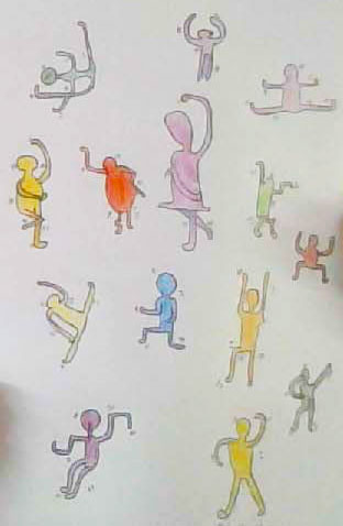
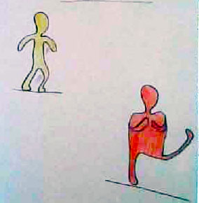
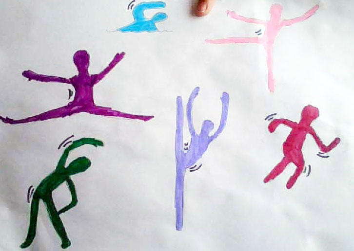
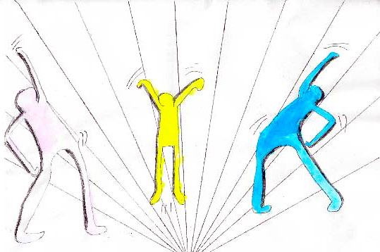
Artists: Year 5 students, 2020
Medium: Various
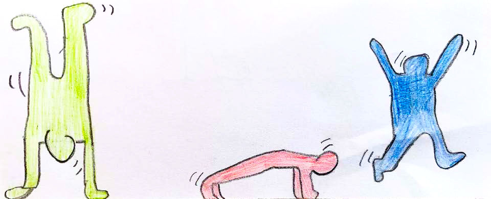
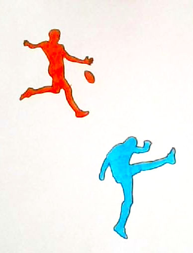
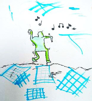
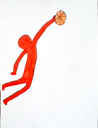
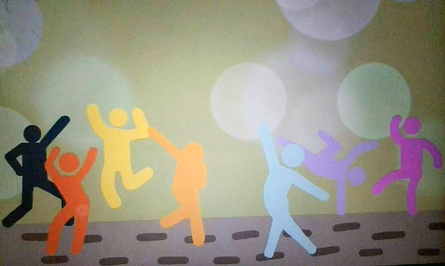
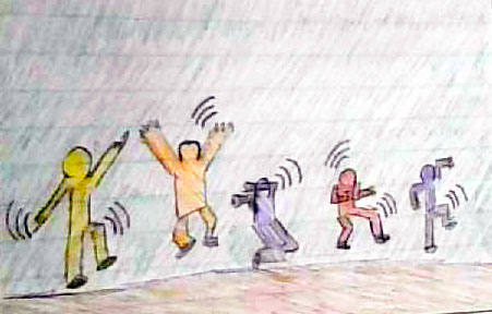
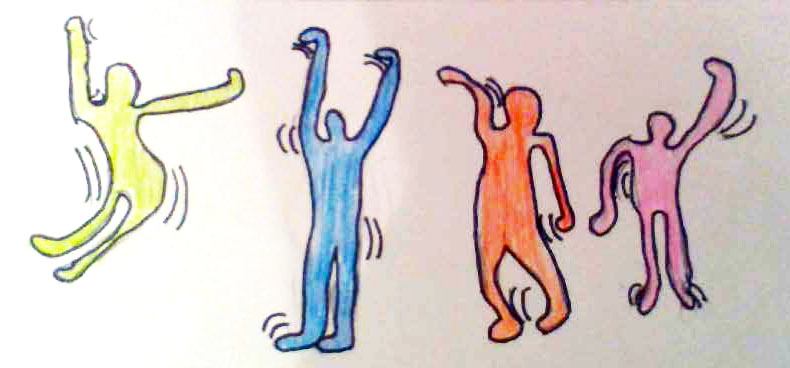
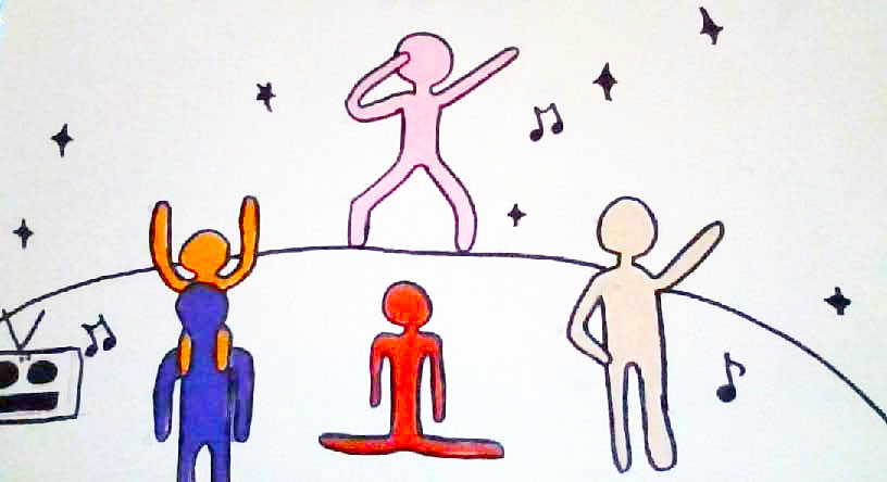
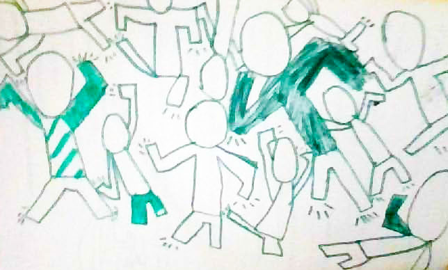
Year 5 students viewed and responded to the artworks of Keith Haring, with reference to the design principles of rhythm and movement.
They engaged in a series of short drawing tasks, the focus of which was to communicate their interests through suggesting action in the human figure.
The students created Visual Arts and Media Arts compositions using action lines and the art elements of line and colour to express emotions, feelings and atmosphere within their artworks.
The artwork in this exhibition was produced during a period of off-campus learning.
Click on an image to enlarge it.
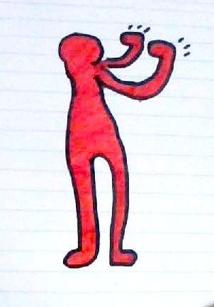
The artistic process
Here, three student artists explain the thought and creative processes they used to develop their artwork.
“I used red colours to show rage; the fight is symbolised by his hands in a boxing stance.”
Andreas A
“I used cold colours like green for the person and blue for the background to show that I wasn’t feeling happy but not angry or annoyed like the colours red and pink. I used the principle of balance [in my] painting, texta and pencil.”
Arabella P
“I tried to use as much colour as i could to bring your attention to the figures not the background (contrast).”
Lily G


